Design system for promotion campaigns AliExpress Russia
Date
2016
Role
UX\Creative Lead
Team
Global UED

Objectives
- Provide a scalable design system to impact global market expansion
- Improve conversion rate and brand awareness
- Localise content for the users, help them to be efficient
- Reduce time spent on promo creation for the internal team
- Reduce time spent communicating with third-party designers
- Increase project productivity in a fast-paced environment
- Establish and continuously Improve workflow between cross-functional teams
Design team pain point
- No design and copyright standard
- Limited time for brand new design
- Inconsistency in design and text
- Last-minute implementation
Product team pain point
- Managing the schedule
- Coordinating Team
- Lack of Information and time
- Misunderstanding, despite long communication
Problem Statement
When I came to work with the Promotion team of the RU market, most of the layouts had random UI components. The main issues we had; no consistency in style and hierarchy, promotions were overly complex and busy in their design.
That influences not only the usability of the campaign, brand awareness, causes a high bounce rate and low conversion to a product detail page. As a result, we underserve a large number of users.

Process
We had not effective workflow for the promotion which was taking 70% of the time for our team. Designers and copywriters had to repeat their work many times. I started an analysis of the current workflow.
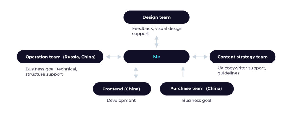
Team collaboration during the project
I invited to collaborate with me the Content strategy and Operation teams, by my lead, we created a new standard for design and team interaction.

Consumers struggle
Internal User Research (Qualitative, Behavioural) study helped me to understand and form the main user’s struggle.
- Struggle to find the information they need to make decisions
- Not clear % of discount information
- Finding out pricing information
- Have trouble finding key information
- Unnecessarily complicated interaction and visual design
- Content is written from the seller’s point of view, not the customer’s
Prototyping
To increase the efficiency of the design solution help the team to understand what might need to be considered in the design process, we created a journey map. A deep understanding of the user journey has a critical influence on the promo conversion rate and success.
I used the “Design Thinking” methodology in order to understand the user journey. Our study helped the team identify opportunities to improve how people made key decisions.
- Make browsing more efficient by providing a hierarchy
- Make selecting products easier by providing clear key points
- Help people make their final decision to purchase by offering a detailed description and emotional atmosphere
Structure
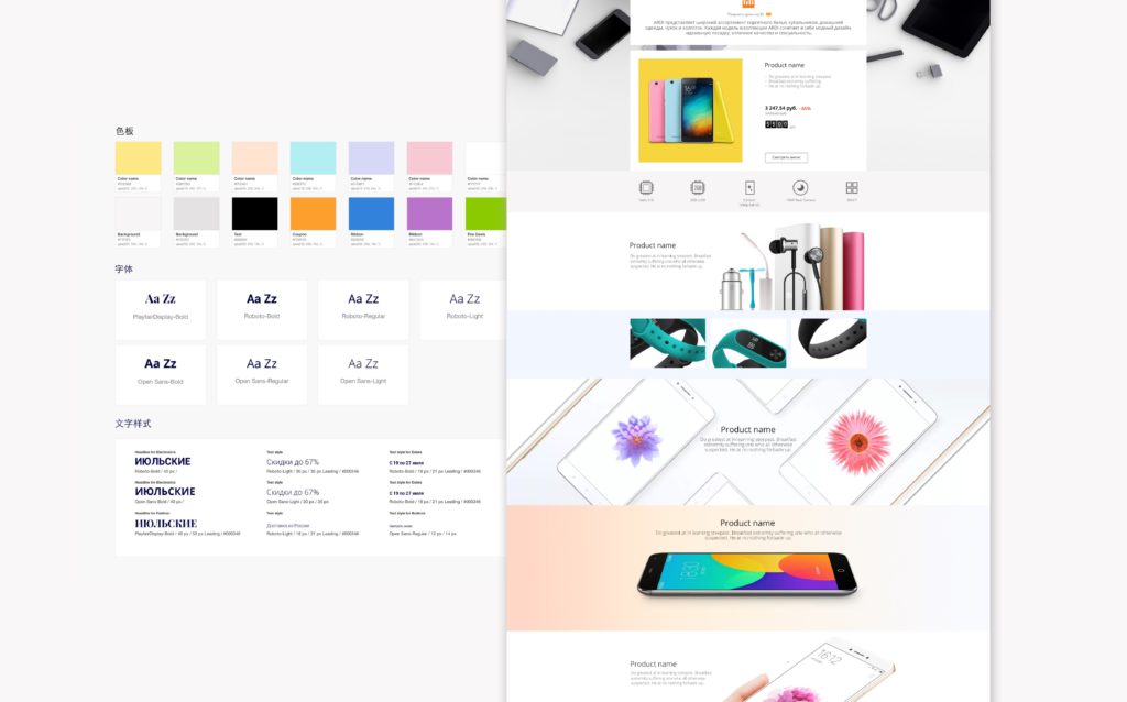
Hierarchy in the layout, divided by key (special), highlighted, and regular products. The order works like a LEGO. Together with the content strategy team, we created a structure as a constructor to be highly customizable by the designer.
I designed 5 templates for different types of promotions.

Customers want to compare similar items from different stores and brands, choose the best price, browse look and feel. And even for exactly the same product, users are starving to get as many details as it is possible.


The guidelines appeared to have main modules, however, after launch, we keep adjusting the UX based on its performance.


I designed the guidelines for multilingual teams from different business units and markets.
The Banners Guideline AliExpress Russia

Result
For the consumers:
The technology that powers shopping is getting better— but still many experiences leave consumers feeling frustrated, unsatisfied. The systematization helped improve the user experience and assessability of purchasing on AliExpress.
The landing page has a clear structure – easy scanning the product description.
Consistent – use the same patterns in design for one category and type of the promotion campaign, in order to make the user familiar with its structure.

For the UED team:
The design quality improvement, systematization of the UX/UI elements. Interaction with business teams, content strategy, third-party partners become efficient.
Increase the speed of creation in fast-paced impairment. Even for this business model is very important to have a scalable solution for monthly promotions we made many unique sales.
For the business:
According to the data for mobile LP, the bounce rate dropped by 38% and our conversion rate increased by 84.5%. The quality product presentation helped to promote many small brands and onboard famous players such a P&G, Loreal, Nespresso, Samsung, Xiaomi, and many others.

Workflow challenge
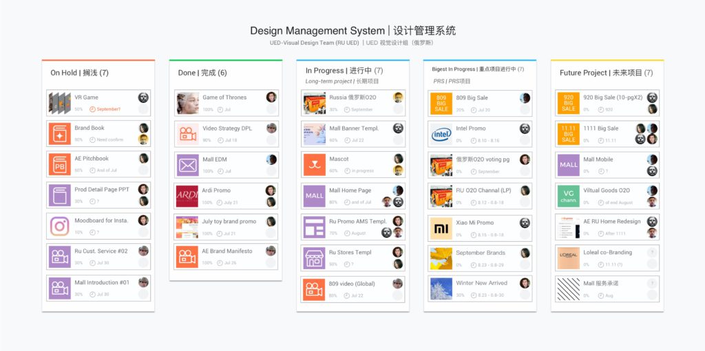
In 2017 in the new office in Russia our team was overloaded with work. This affected the quality of our output. At that time our workflow system didn’t give the international team real-time communication of capacity and full transparency of work in progress. Even we had a template system for the promotions the content and design weren’t consistent.
I created a process for submitting design requests that would allow us to estimate the resources needed for a project. I established a promo performance review to detect weak UX solutions and implement changes based on the data approach.
I rolled the process across the Russian company it is embedded into the systems.
The system has improved project productivity by 2.5 times and has been made the company’s standard.

Most of the tasks were coming through Excel. I adapted for my team an internal Alibaba tool. In the beginning, the process was quite challenging since the tool supported only the Chinese language. In addition, many colleagues weren’t ready to use a new tool.
However, I created detailed guidelines to help them out, conducted a series of training.
As a result, cross-team adapted to the new system, moreover, task management becomes easy and transparent. The team was able to double it’s capacity.


